CAT Project
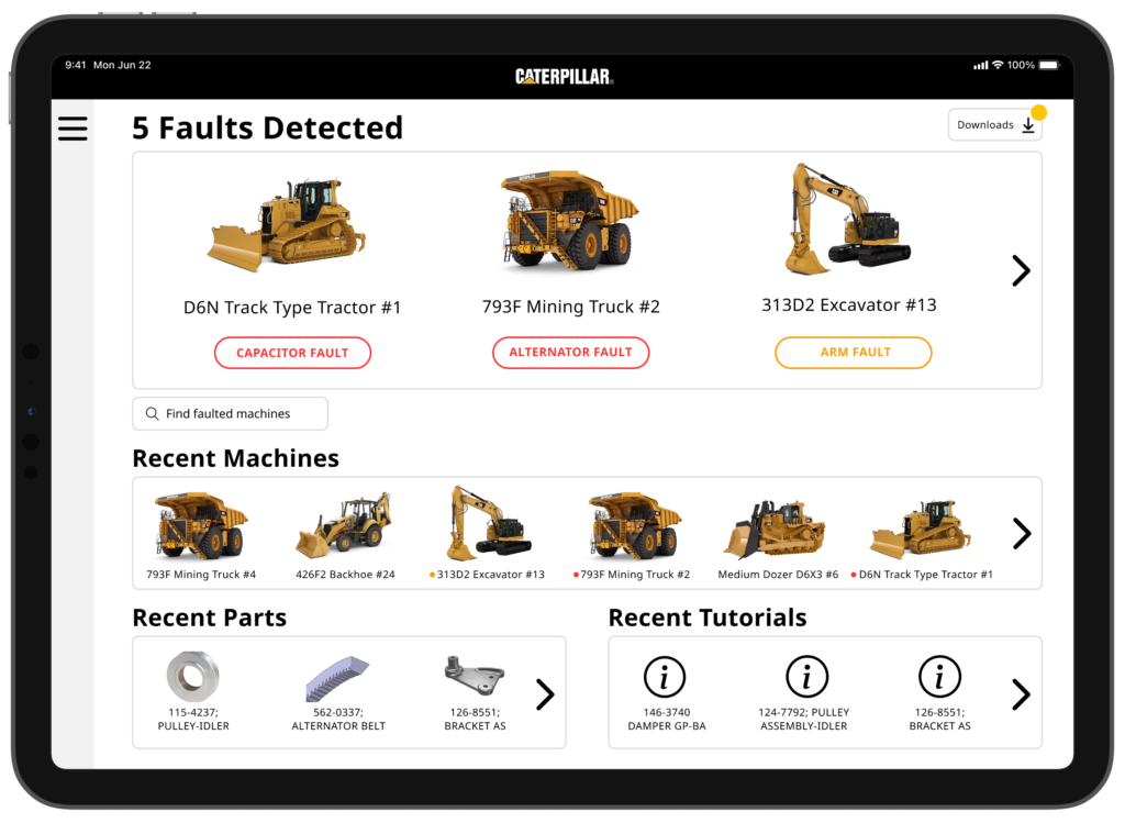
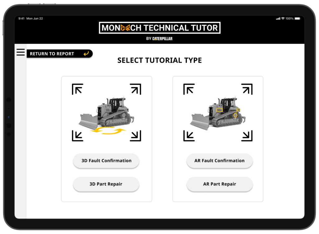
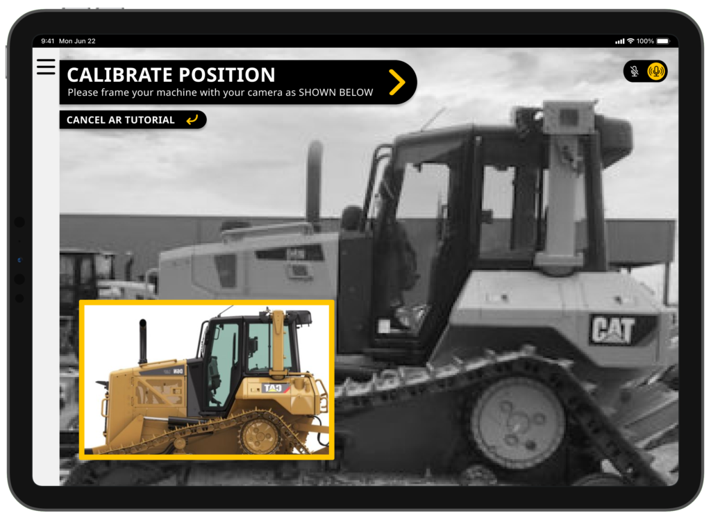
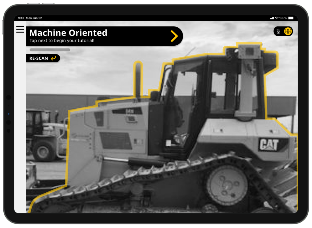
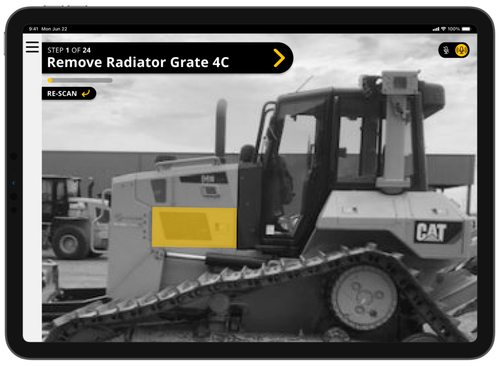
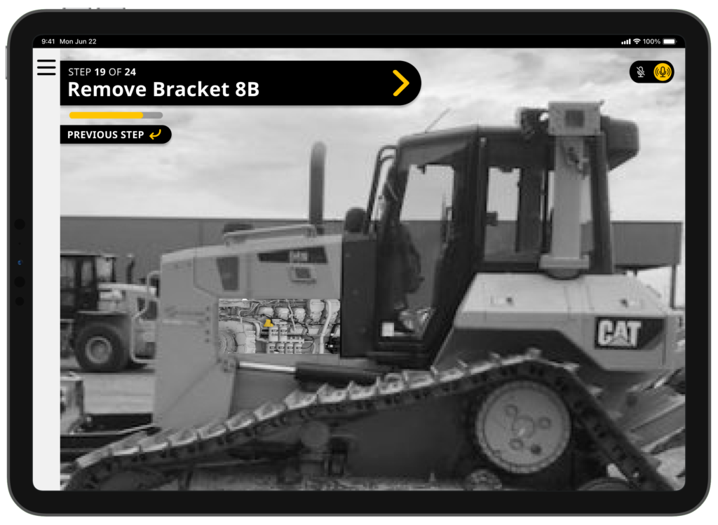
In this project, I worked in collaboration with Caterpillar and a small team of designers to create an AR application that allows technicians to better understand and repair their equipment.
This was presented to Caterpillar on World Usability Day.
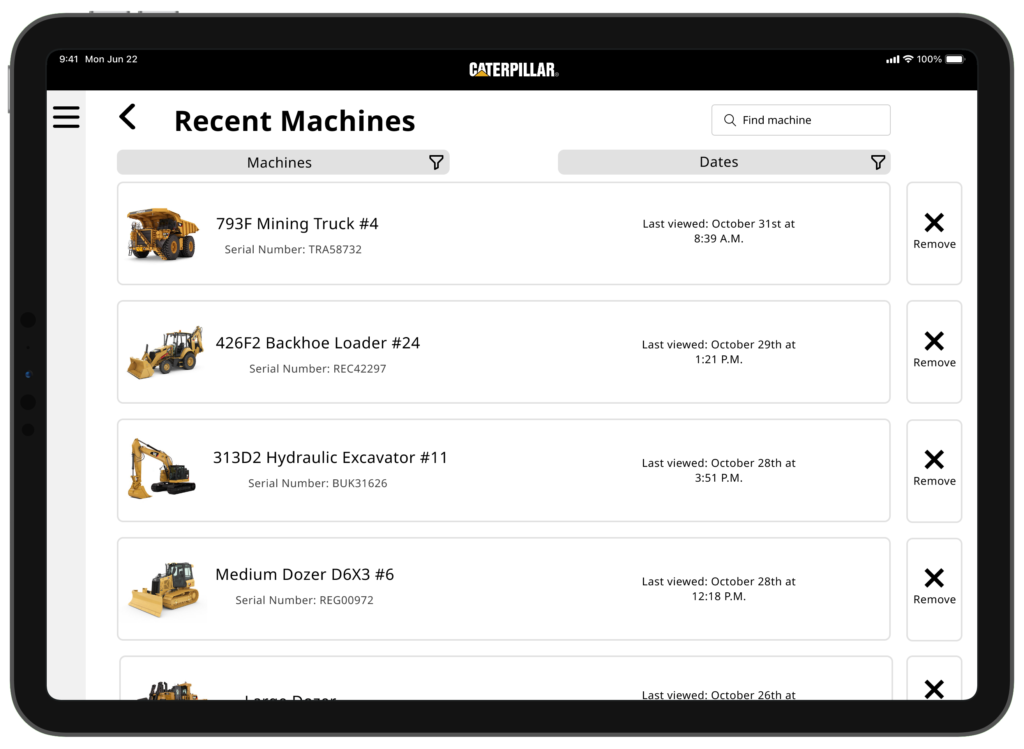
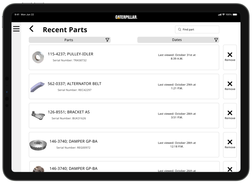
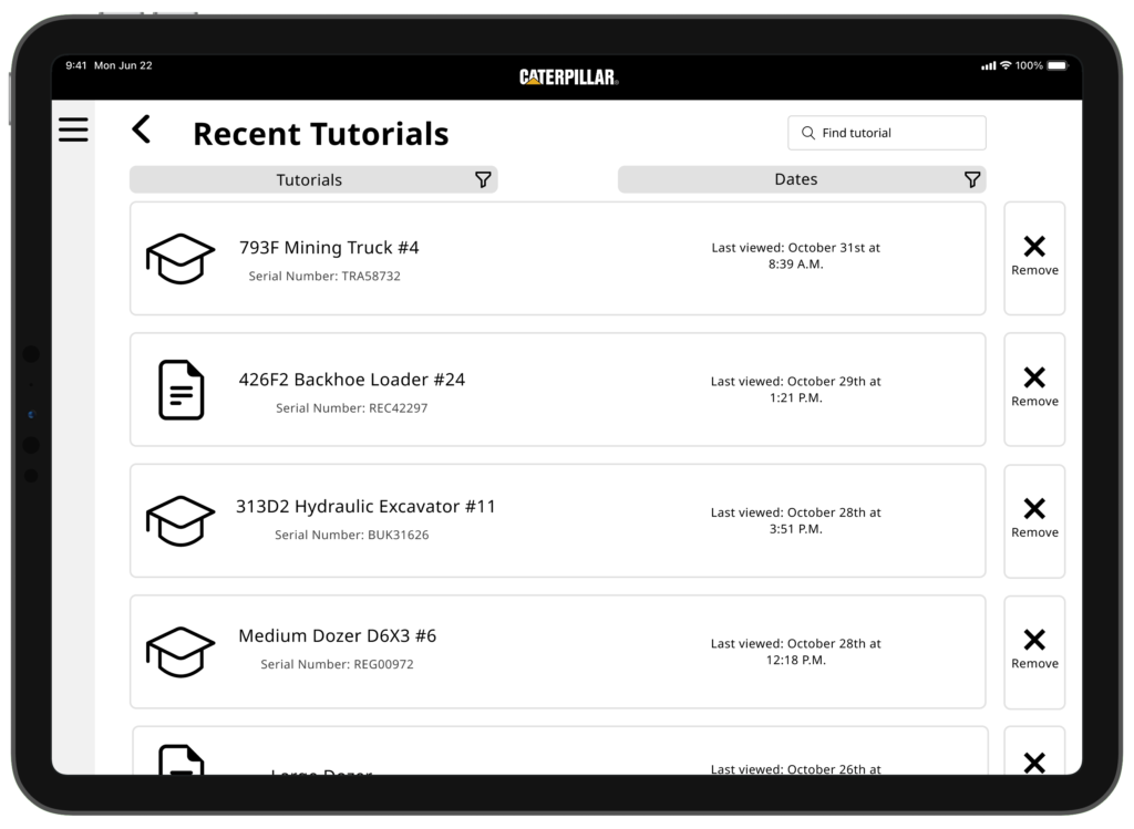
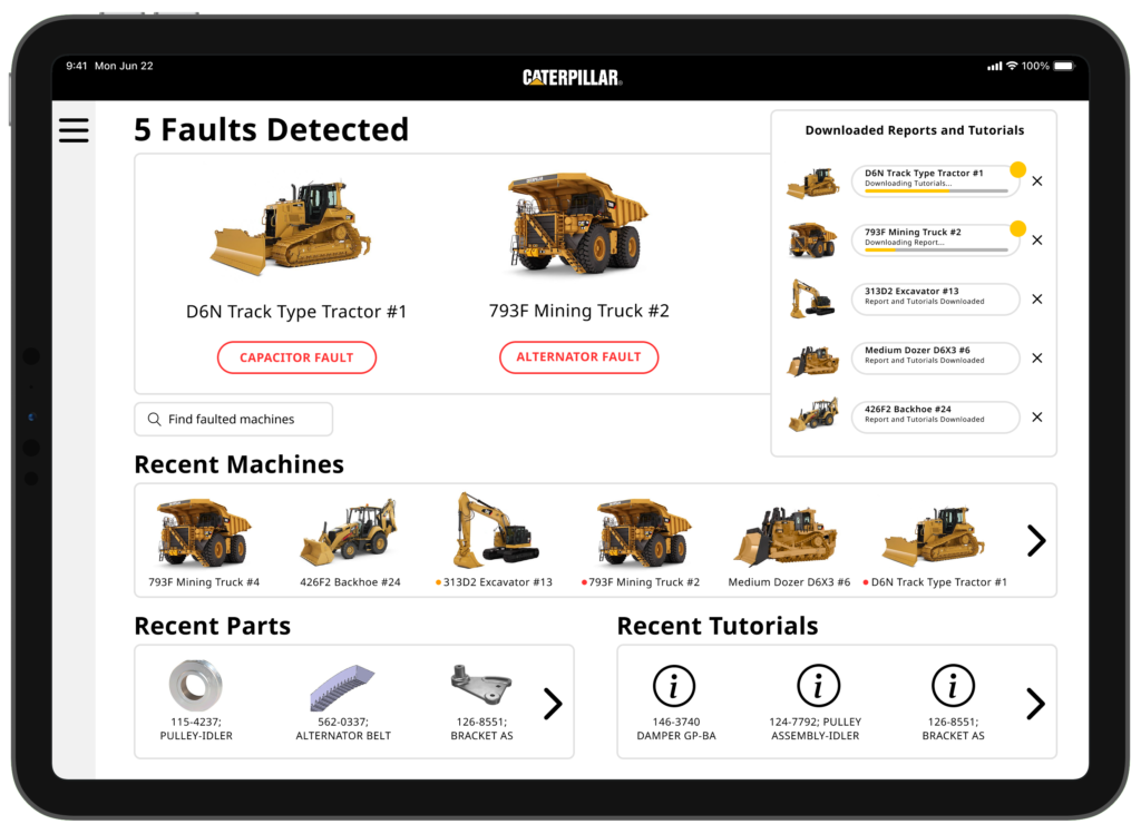
Case Study
Problem Statement
Machinery is complicated and Engineers may not always have the resources or knowledge necessary to deal with potential issues as they arise. There was a need for a cost-effective solution that simplified, standardized, and streamlined preventative maintenance processes for Engineers.
Objective
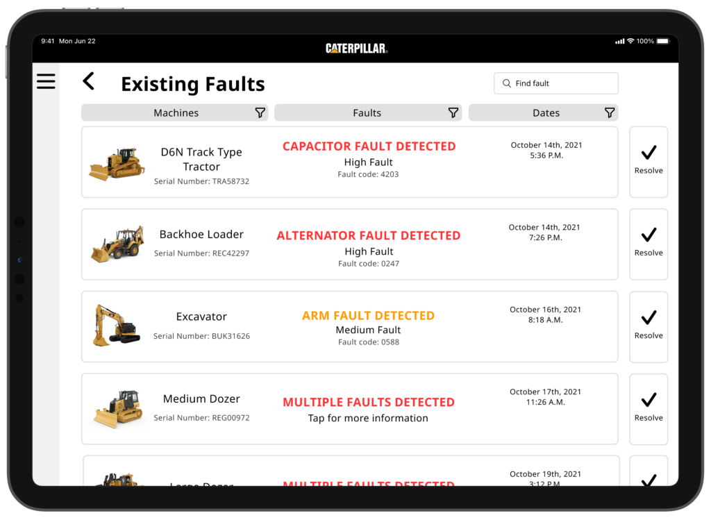
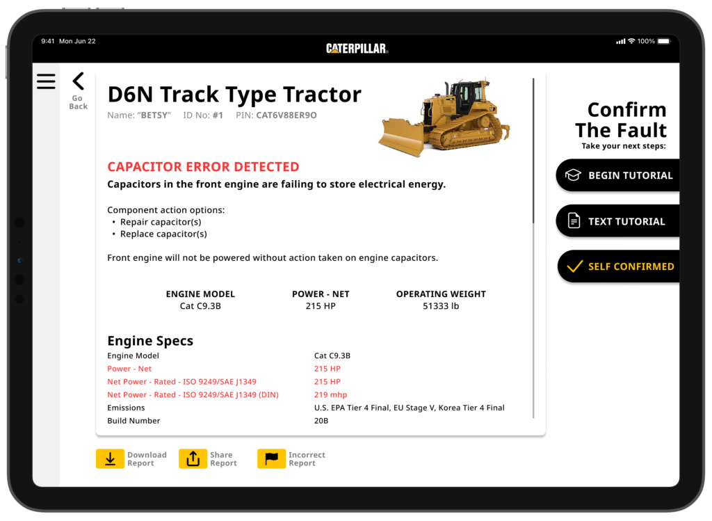
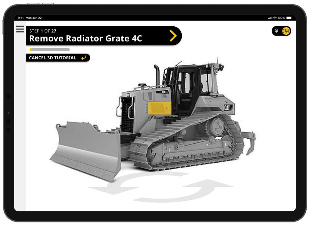
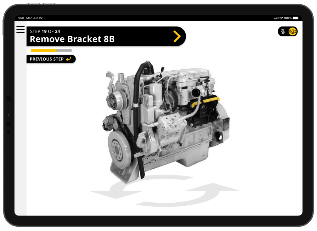
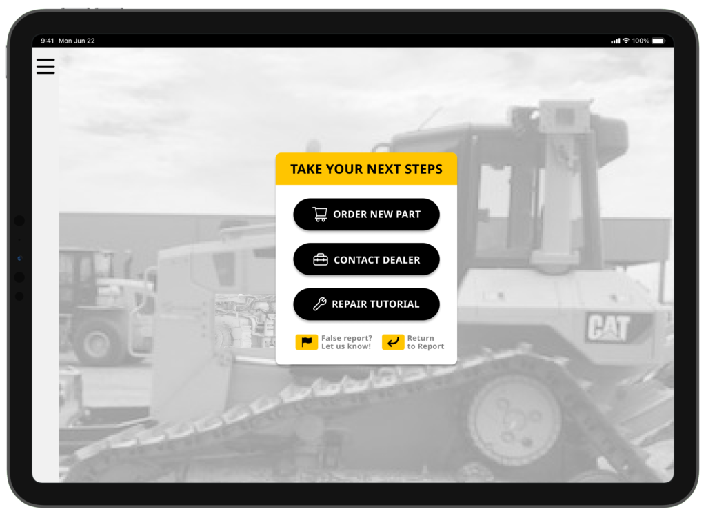
The primary aim for this project was to design an Augmented Reality (AR) solution that would simplify and streamline maintenance processes for Engineers. Our tablet application aims to deliver real-time, contextual information overlaying the machinery to provide a more straightforward and efficient way to perform and understand maintenance tasks. The application was also designed to utilize real-time analytics from connected machinery to determine current status and issues through the use of Machine Learning (ML).
Design Process
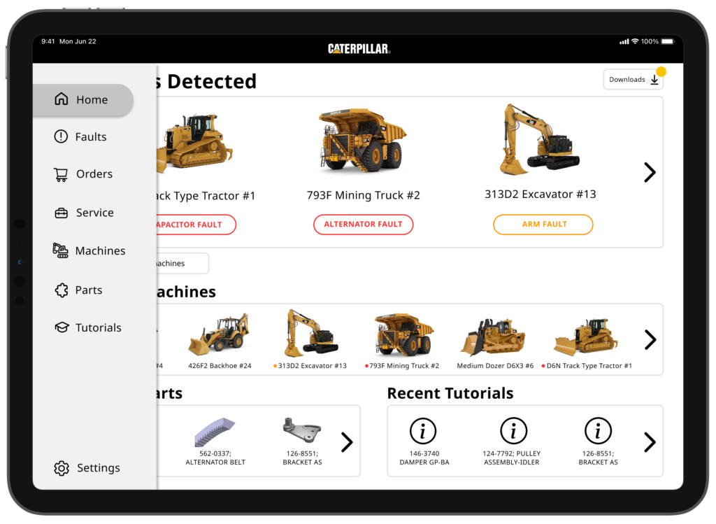
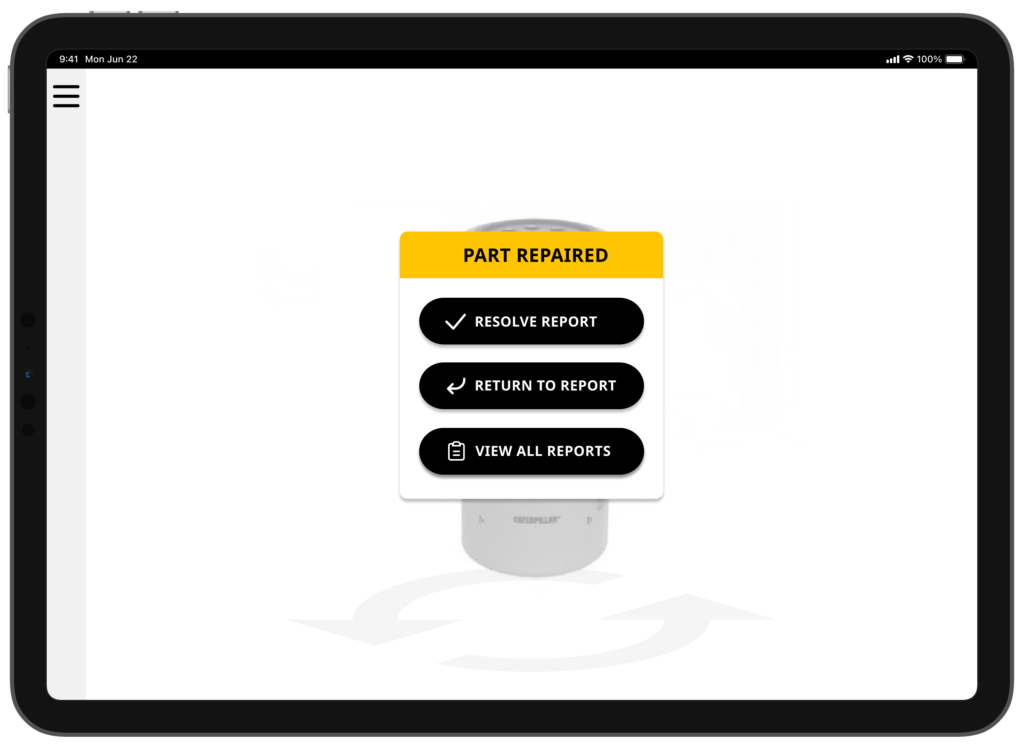
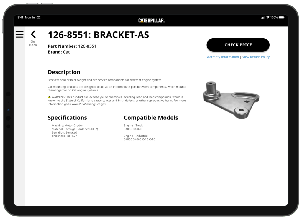
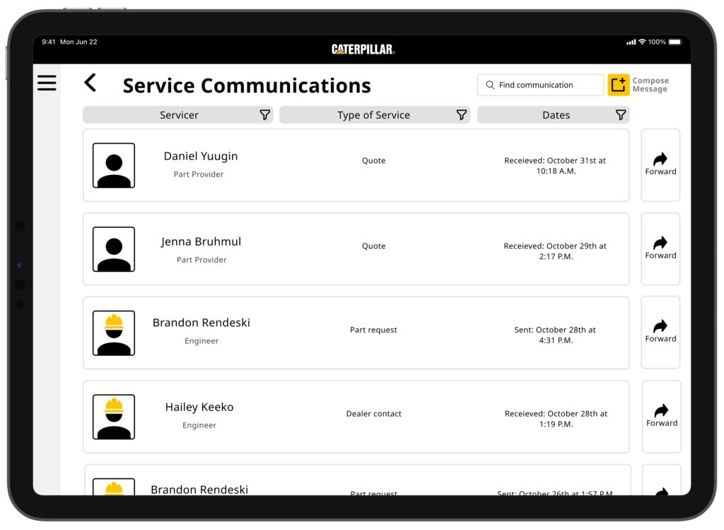
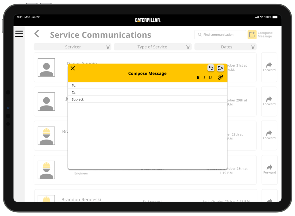
The design started with brainstorming sessions to understand the specific needs of CAT’s maintenance teams. After narrowing down the scope and creating some sketch framework, we took to Figma and developed the initial prototype, focusing on a user-friendly interface that would allow technicians to view critical information by pointing the tablet at the machinery. Icons, diagrams, and other visual elements were crafted in Adobe Illustrator to enhance clarity and usability.
User Testing
To ensure the app met the needs of its users, we conducted user testing with technicians, engineers, and individuals of varying technological skill levels. We collected valuable feedback on the prototype’s functionality and ease of use, and this feedback was instrumental in refining the interface, making it more intuitive and efficient.
Outcome
The prototype successfully demonstrated how AR could transform machinery maintenance by making it easier to access and understand critical information. The app was well-received by technicians for its ability to provide real-time insights and streamline complex maintenance tasks, showing great potential for further development and deployment.
Supporting Media

Tools & Skills Used
Tools
Figma: Utilized for crafting high-fidelity wireframes, interactive prototypes, and to facilitate real-time feedback
Adobe Illustrator: Leveraged to design custom elements, iconography, and the mood board
Google Products: (Sheets, Forms, Calendars, Drive, etc.) for conducting and organizing user interviews, scheduling sessions, and collecting feedback
UserTesting.com: This site was used to find candidates for some of our usability tests and interviews. This allowed us to reach a wider demographic of professional users of varying skill levels
Skills
Information architecture Design: Orchestrated the logical structure and organization of the application’s content and functions
Persona creation: Developed detailed user personas to encapsulate the needs, preferences, and pain points of the target audience
User interviewing and testing: Conducted thorough user interviews to gather qualitative data about user needs, challenges, and expectations
Mockups and Wireframes: Using Figma, we crafted quality mockups, infusing color, typography, and aesthetic details to create high-fidelity wireframes and prototypes
Asset Creation: Leveraged Adobe Illustrator’s precision and versatility to create high-quality, scalable vector graphics that were crucial to the interface
AR design principles: Implemented best practices specific to augmented reality design, ensuring that the application is immersive, and user friendly
