OSF Project
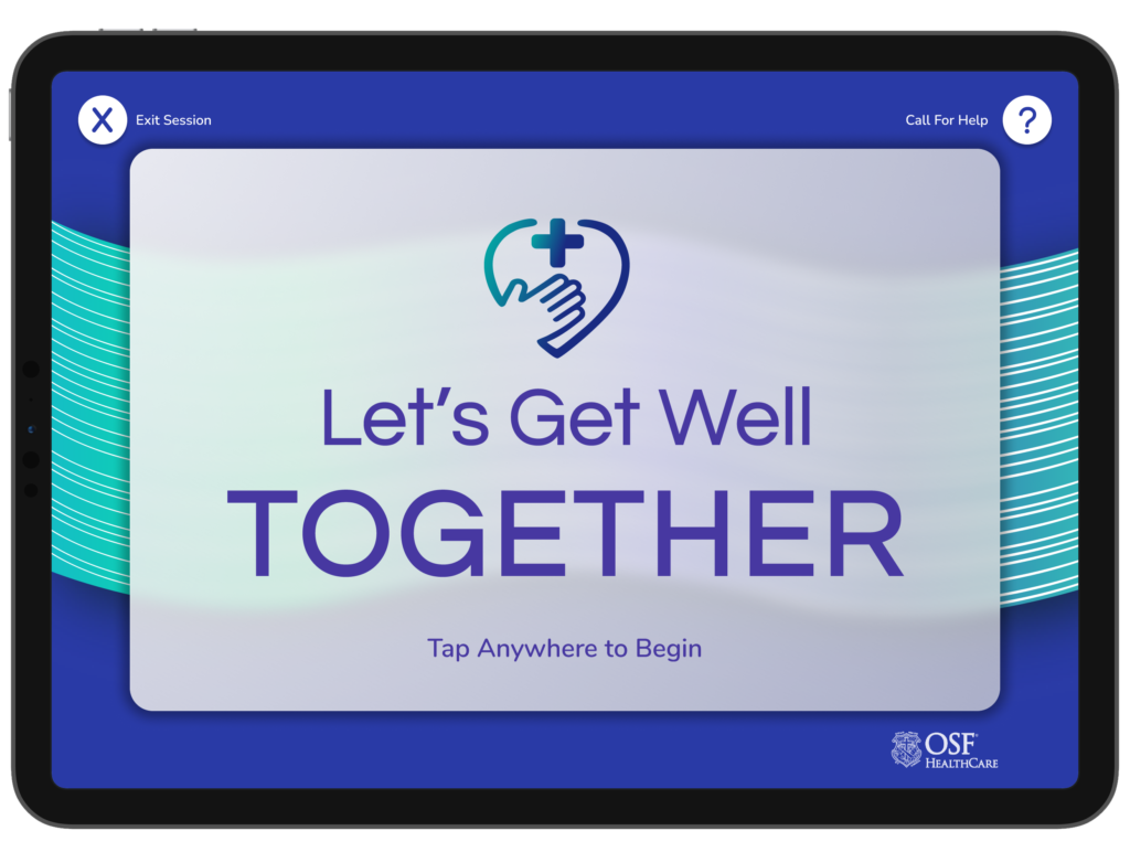
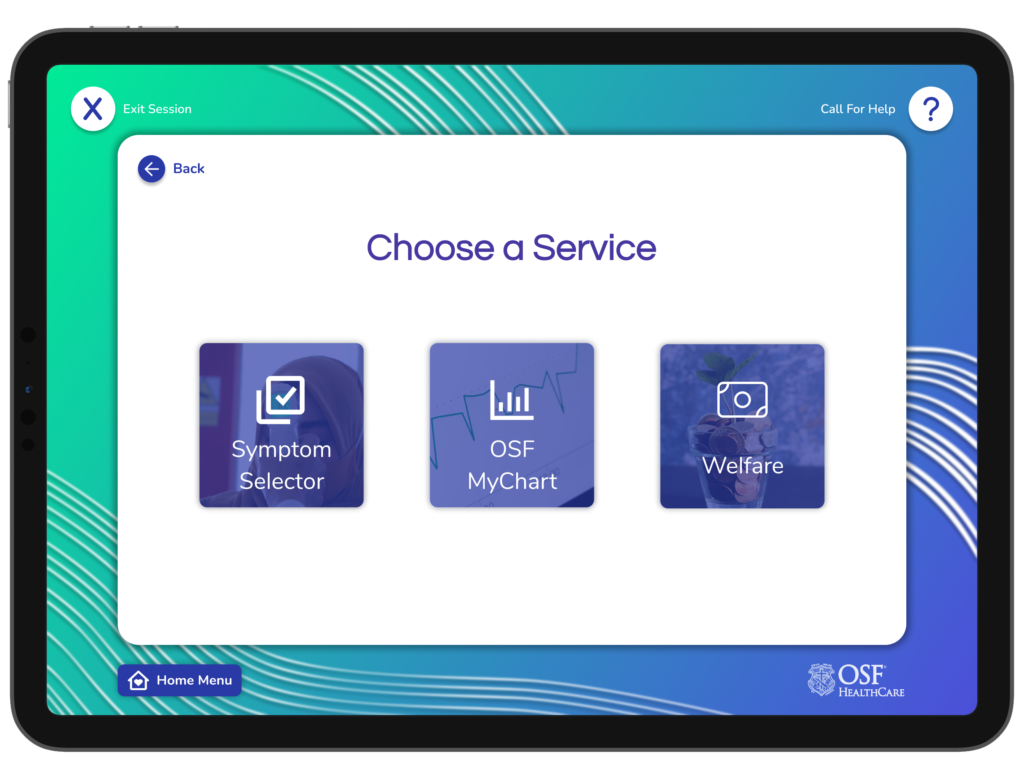
In this project, I worked with a team of talented designers, and in collaboration with both OSF and Jump Simulation. My team and I designed a kiosk application to be used by the homeless population to assist them with healthcare, transportation, and financial needs or opportunities.
Case Study
Problem Statement
The homeless population often faces challenges accessing basic necessities, particularly healthcare, transportation, and financial opportunities. Traditional solutions often require multiple touchpoints, scattered across a city, making it difficult for individuals to find and take advantage of these services. There was a need to develop an application that centralized these services and made them available in critical areas.
Objective
Design a user-friendly kiosk application that can centralize information on healthcare, transportation, and financial opportunities tailored for the homeless population, ensuring that it’s intuitive, robust, and low-barrier to use.
Design Process
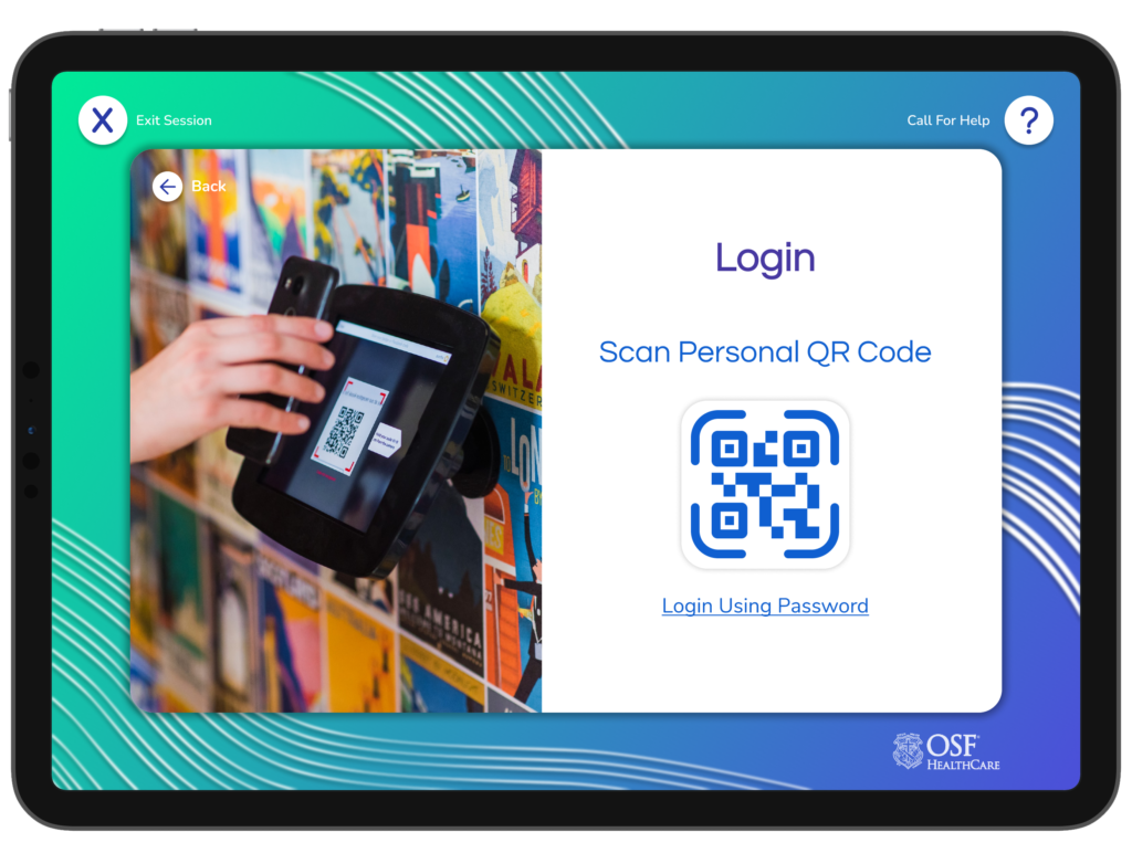
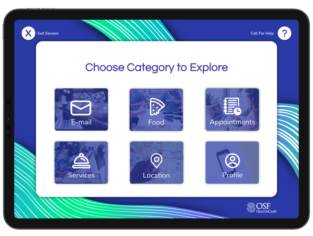
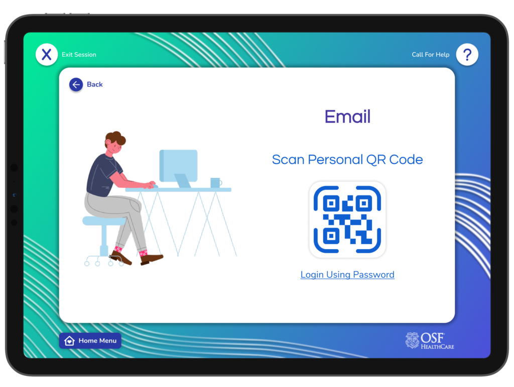
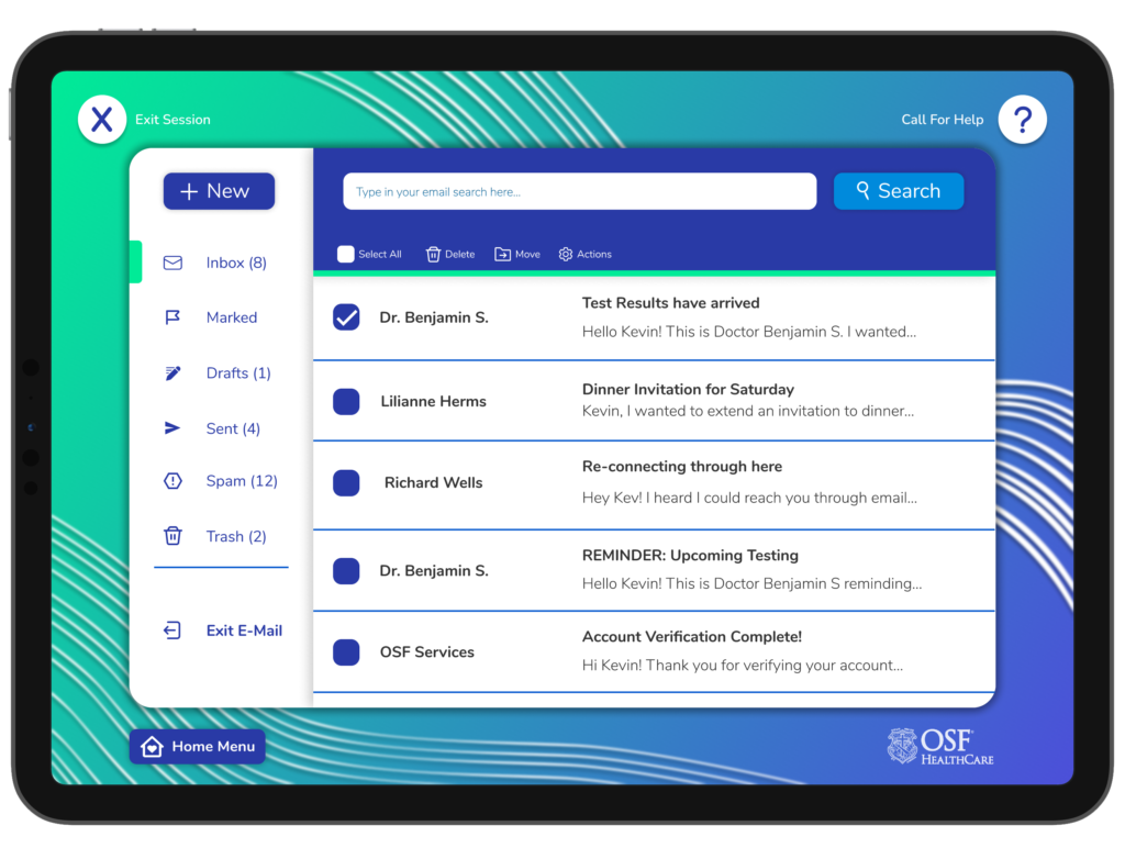
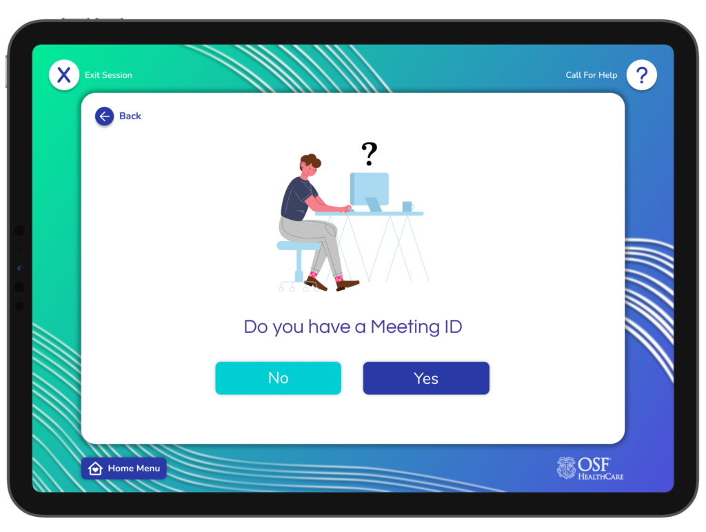
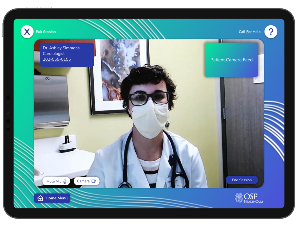
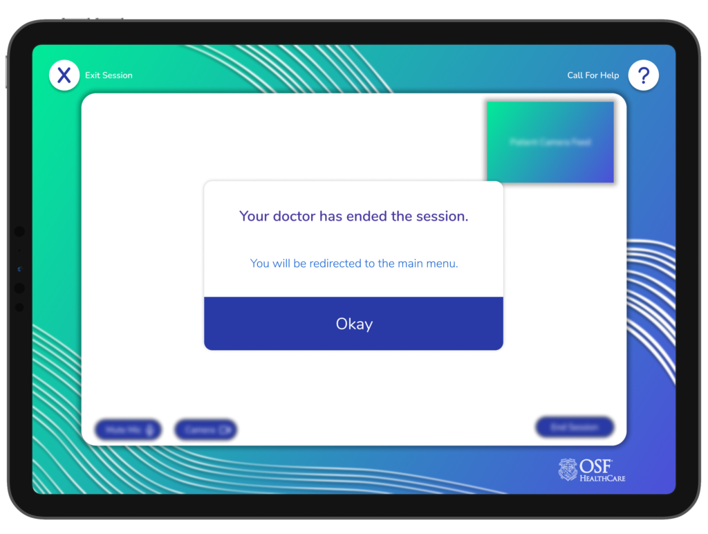
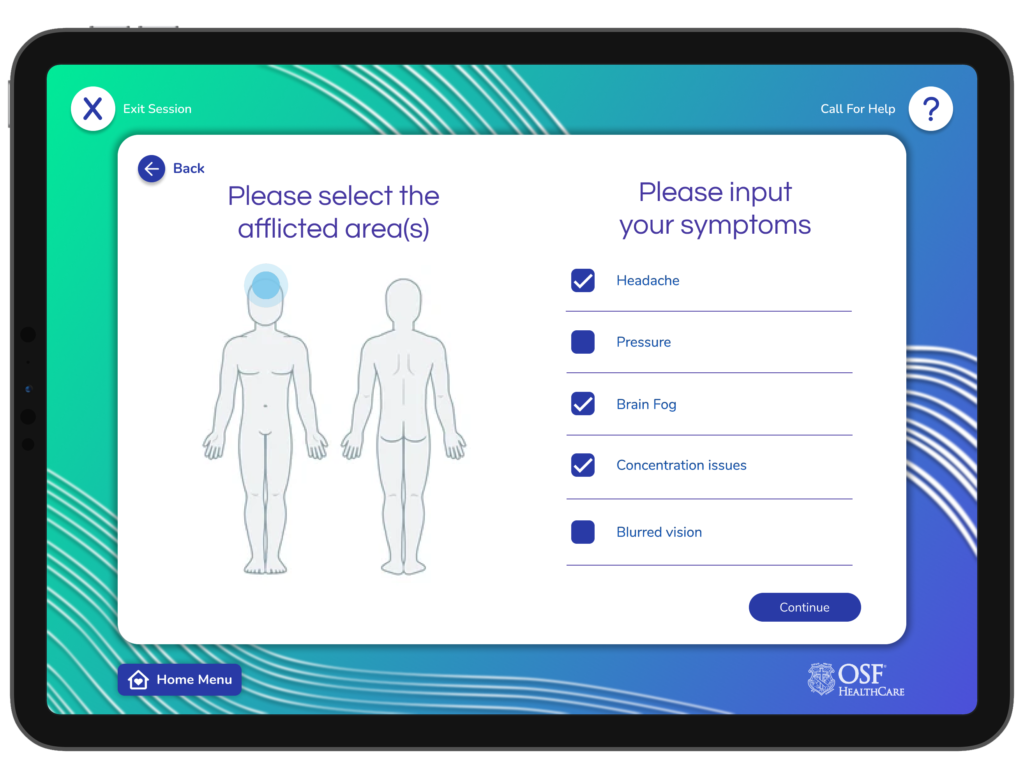
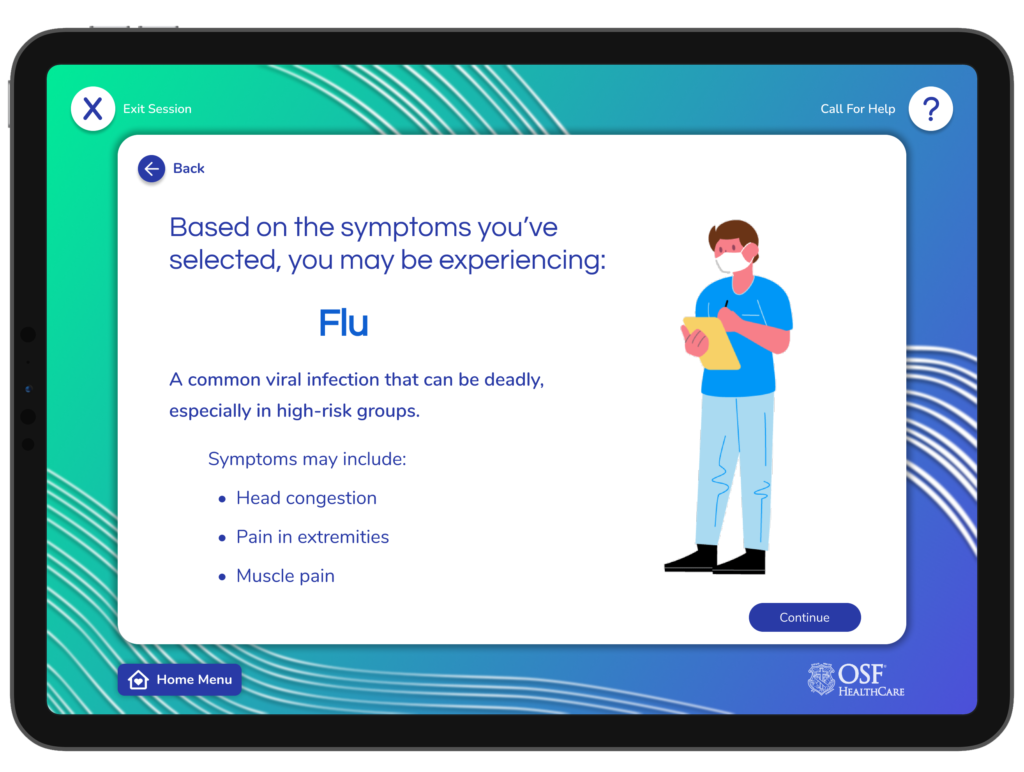
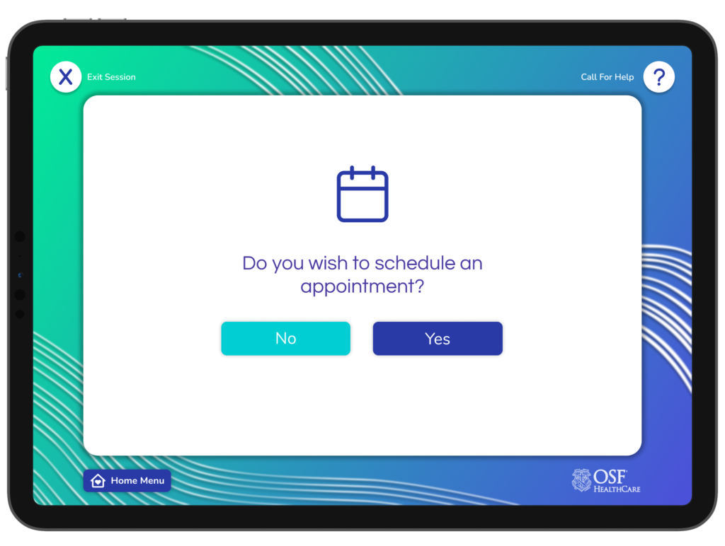
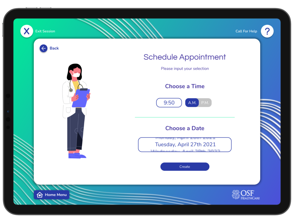
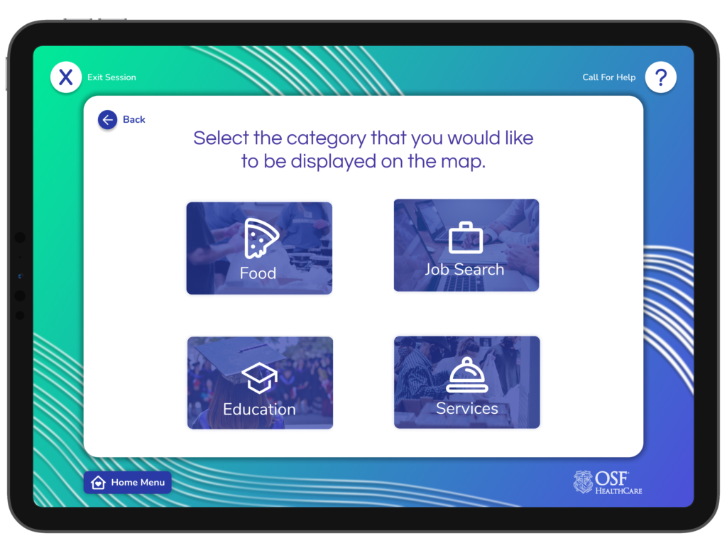
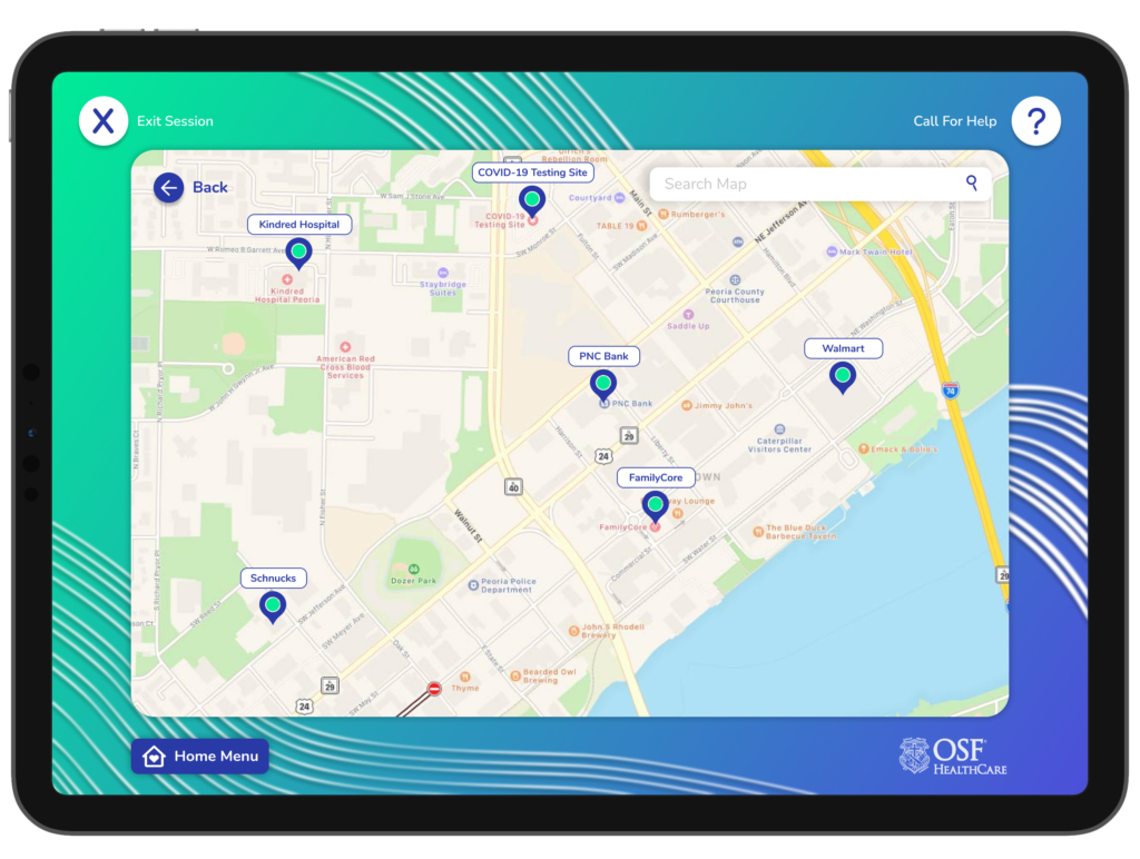
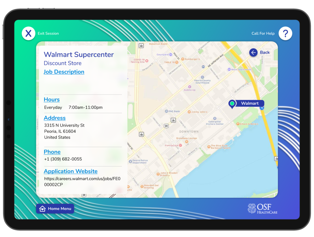
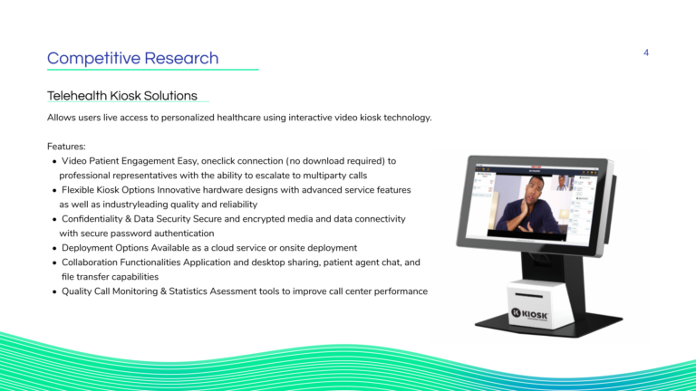
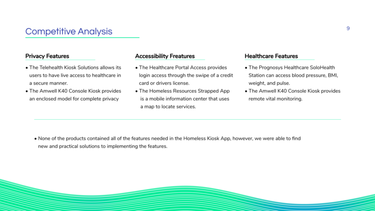
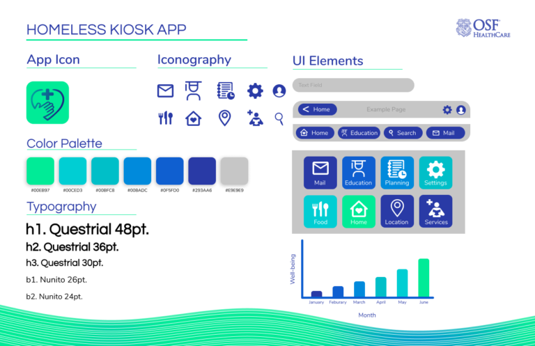
We began by conducting research to understand the unique needs and challenges of the homeless community in Peoria. Based on our findings, we focused on designing a simple, low-barrier interface that could be easily navigated by users with varying levels of digital literacy. Using Figma, we developed high-fidelity wireframes and prototypes that featured clear icons, straightforward language, and intuitive navigation.
Prototyping and Development
The prototype was developed with accessibility in mind, ensuring that users could easily access essential services without feeling overwhelmed or confused. We incorporated features such as large touch targets, a minimalistic design, and multi-language support to cater to a diverse user base. The application also included direct links to healthcare providers, transportation services, and job opportunities, aiming to connect users with vital resources quickly.
User Testing
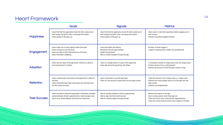
To ensure the application was effective and user-friendly, we conducted user testing with individuals from the target demographic. Through interviews and hands-on testing sessions, we gathered feedback on the app’s usability and accessibility. This feedback was crucial in identifying potential pain points and making necessary adjustments, such as simplifying the navigation flow and improving the clarity of instructions.
Outcome
The final prototype successfully demonstrated the potential of the kiosk solution to provide essential support to Peoria’s homeless population. Users appreciated the app’s simplicity and the direct access it offered to critical resources. The project received positive feedback from OSF Healthcare and Jump Studios, who recognized its potential to make a meaningful impact on the community. With the prototype in place, the application is now set for further development and deployment, with the hope of helping those in need access the services they require.
Supporting Media
Tools & Skills Used
Tools
Figma: Utilized for crafting high-fidelity wireframes, interactive prototypes, and facilitating real-time feedback
Adobe XD: Utilized temporarily for developing low-fidelity mockups and design ideas
Adobe Illustrator: Leveraged to design custom elements, iconography, and the mood board
Google Products: (Sheets, Forms, Calendars, Drive, etc.) for conducting and organizing user interviews, scheduling sessions, and collecting feedback
Skills
Mockups and Wireframes: Using XD and Figma, we crafted detailed wireframes that laid the groundwork and provided clarity for the user interface. we transitioned these mockups, infusing color, typography, and aesthetic details to create high-fidelity visuals and prototypes
Asset Creation: Leveraged Adobe Illustrator’s precision and versatility to create high-quality, scalable vector graphics that were crucial to the interface
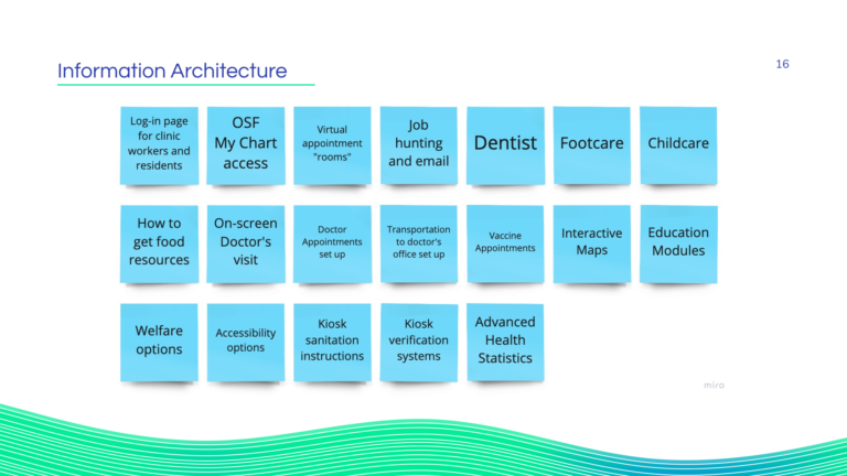
Information architecture Design: Orchestrated the logical structure and organization of the application’s content and functions
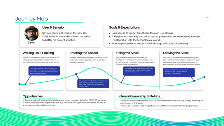
Persona creation: Developed detailed user personas to encapsulate the needs, preferences, and pain points of the target audience
User interviewing and testing: Conducted thorough user interviews to gather qualitative data about user needs, challenges, and expectations
Visual design & aesthetic: Crafted a visually appealing interface and aesthetic that not only looked good but enhanced the functionality and intuitiveness of the tablet-kiosk experience
